GRAPHIC DESIGN I • SELF PORTRAIT TUTORIAL - READ ALL FIRST
Please work on this Portrait Tutorial while I finish helping people
finish their Cause Posters. This is a SUGGESTED way to do a portrait.
Please feel free to look for another Tutorial to work on the Portrait.

Please use today's class to read through and follow these Step-by-Step instructions to learn how to make the work on your self portrait project a little bit easier. This is a Beginner Level Tutorial I found for you to follow.
You will go as far as you can today - use the entire class to work on this Tutorial. Work together, help each other. Do what you have to do to get as far as you can on this.
If you run into a problem that you cannot solve on your own - go to the next step or another Step that looks easier. Then go back to any Steps or Parts that were a problem for you.
At the end of Class, Save this as a Practice Tutorial on your 562 number and on your Flash Drive.
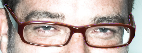
The photo above is the original photo that the Author of the Tutorial is using - and letting us use -
to get better at doing this kind of work.
Click on the Download File below to get the Photo of the Writer of this Tutorial.
If you don't use your own picture, you will use this one:
You will go as far as you can today - use the entire class to work on this Tutorial. Work together, help each other. Do what you have to do to get as far as you can on this.
If you run into a problem that you cannot solve on your own - go to the next step or another Step that looks easier. Then go back to any Steps or Parts that were a problem for you.
At the end of Class, Save this as a Practice Tutorial on your 562 number and on your Flash Drive.
The photo above is the original photo that the Author of the Tutorial is using - and letting us use -
to get better at doing this kind of work.
Click on the Download File below to get the Photo of the Writer of this Tutorial.
If you don't use your own picture, you will use this one:
| 1a.jpg |

Introduction
Some people may think it's so easy to trace a photo, and that this tutorial is useless. I think it is extremely important to know how to do even the simplest things well. I have seen too many people try to trace a photo for an illustration and the end product is less than desirable to say the least.
The basic idea of this tutorial is to showcase how using the the process of tracing the basic shapes and contours of a photograph, as opposed to using predominately vector lines with strokes, as many beginning illustrators do, will result in a desirable, realistic yet stylized image.
Starting with a great photo is obviously a huge benefit to this style of illustration. Luckily, Kyle LaMere of ISR was able to supply me with a really nice photo from his 'Visitors' Series. Thank you Kyle.
Tutorial Details
- Program: Adobe Illustrator
- Difficulty: Beginner
- Estimated Completion Time: 2 hours

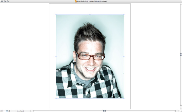
STEP 1A
Open the source photo. In this case I'm using an image of myself.
You can of course substitute your own image.
STEP 1B
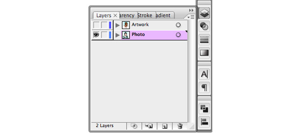
Lock the photo and make a new layer on top.
STEP 2A
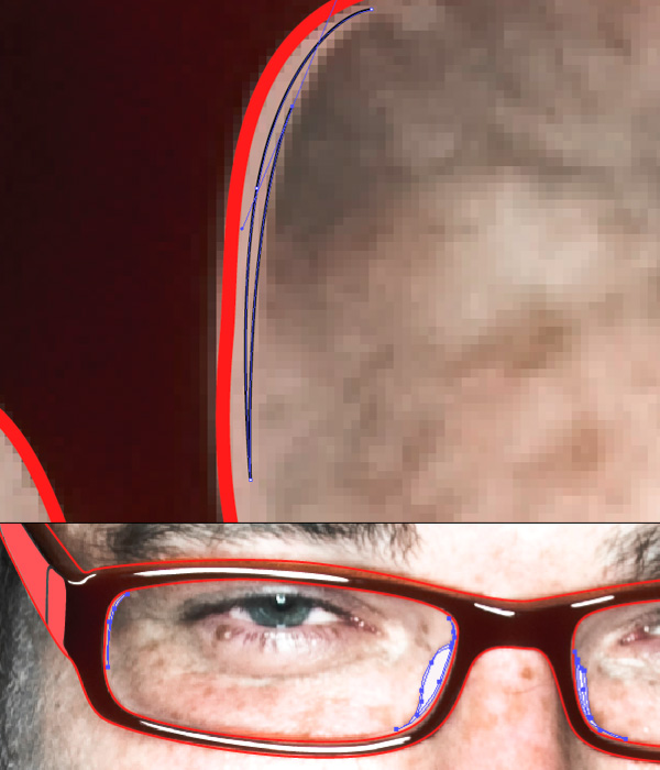
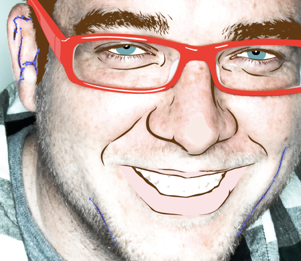
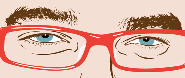
Start by tracing the outline of the glasses.
Notice how clear the photo is up close . . . is yours?
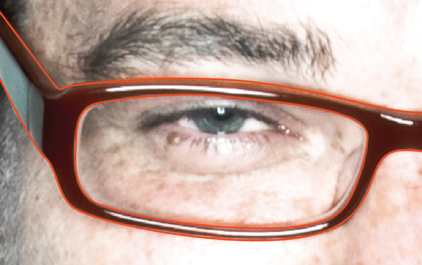
STEP 2B
If you notice there are so many different shapes, shades, and highlights that make up the glasses, specifically within the interior shapes of the lens and frame, so you have to make a decision on how detailed/complex you want to make the image. Since this tutorials purpose is not an extreme photo-reaslism look, I will keep it relatively simple.
STEP 2C
Be sure to stay consistent on which shapes/shades you are following.
Trace both the interior and exterior shape of the frames.
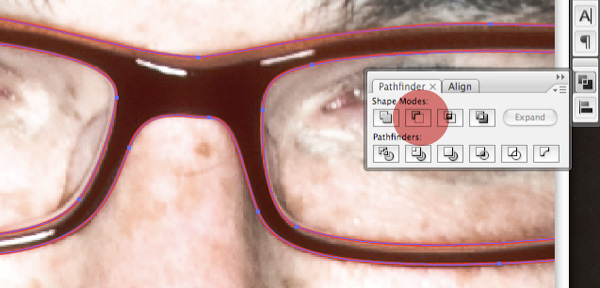
STEP 2D
Select both the interior and exterior shapes, choose the Subtract From Shape Area option in the Pathfinder palette, while holding Option to expand to one shape. Now you have one shape that makes up the base glasses.

STEP 2E
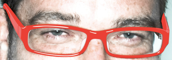
Trace the bright (white) highlights on the glasses. Change them from a red stroke to white fill.

STEP 2F
In addition to the highlights also trace the secondary highlights on the glasses and change them to a lighter red (#F47471). That is the code # for the Web Color he has specified.
In addition to the highlights also trace the secondary highlights on the glasses and change them to a lighter red (#F47471). That is the code # for the Web Color he has specified.
STEP 2G
Even though they are clear we'll need to describe the lens and the nose pieces. You may have to finesse the shapes a bit, drawing them so they look right as opposed to sticking straight to the photo because the shapes are not well defined. Change them to a light gray (#EFE6E8 Web Color Code).
You guys don't have to get this detailed unless you want to. I wouldn't.
STEP 2H
That's it for the glasses, switch the stoke to a fill (#EF4136).
STEP 3A
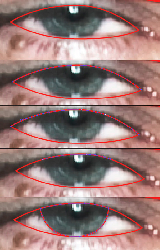
Now trace the white shape of the eye. In order to get the shapes to align perfectly, select the top point of the eye shape, copy and paste a duplicate point on top. Add new anchor points using the Add Anchor Points Tool (+) where the pupil comes down from under the eyelash. Delete the extra end points and continue to draw the pupil using the top duplicated points. This is a very simple, yet useful tip that will help keep the shapes aligned and organized.
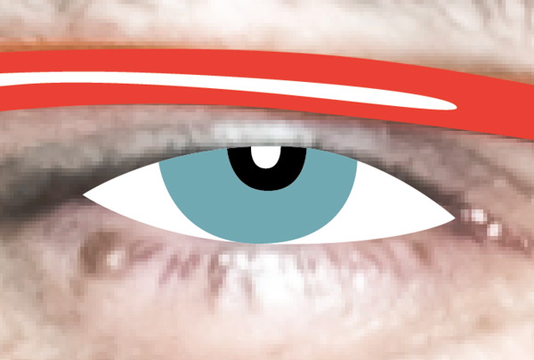
STEP 3B
Simply use the process described above to get the black shape of the pupil as well as the white highlight shape.
Color them as they are in the photo, black, white and light blue/gray (#72A8B2).
STEP 4A
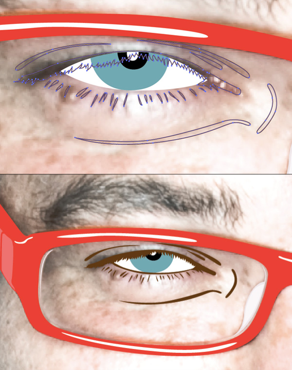
The eye lashes and shades that describe the upper and lower eyelids are so thin and subtle, they need to be exaggerated a bit.
Trace them, and change them to a dark brown (#603913).
STEP 4B
Do the same to the other eye.
STEP 5
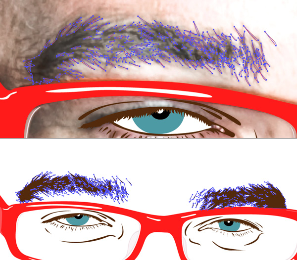
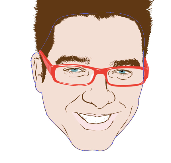
Tracing the eyebrows will be tedious, but if you take the time to really get into the detail, they can look phenomenal. Change them to the dark brown of the other facial features. Here is a peak at how its coming alon
STEP 6
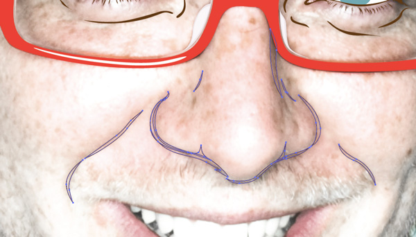
The nose can be a huge pain in the butt to get it to look natural. Do the simple line-work, tracing just the edges of the nose and cheeks. Change it to the same dark brown as the other facial features.
STEP 7
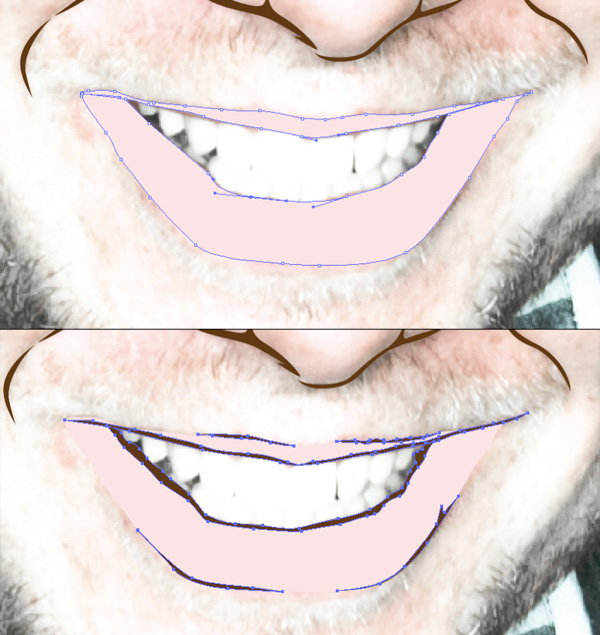
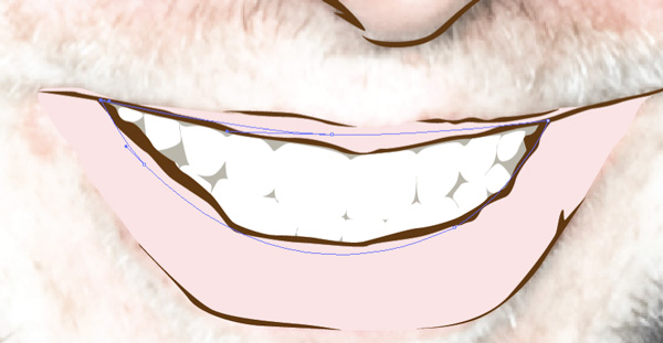
The key to drawing the mouth is to not outline the entire mouth with the dark line-work like a clown. Draw the shape of the pink-ish part of the lips, and change it to a light pink (#FDE4E3). Then do the thin linework around the mouth, using only small shade shapes where needed.
STEP 8
Once the mouth is established, finishing the smile with teeth is fairly easy. You don't need to draw every tooth, you just put in a few shadows that hint at the teeth. Fill these teeth shadow shapes with a light cream (#E2D7D3) color. Draw a large white shape behind all of the shadows.
Once the mouth is established, finishing the smile with teeth is fairly easy. You don't need to draw every tooth, you just put in a few shadows that hint at the teeth. Fill these teeth shadow shapes with a light cream (#E2D7D3) color. Draw a large white shape behind all of the shadows.

STEP 9A
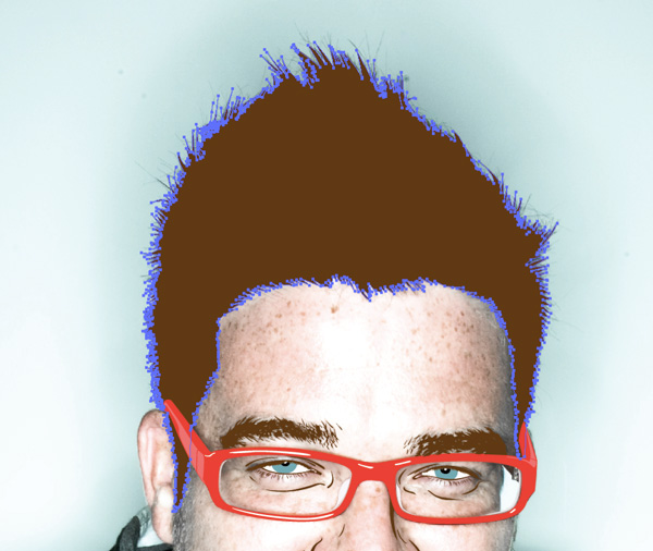
Vector hair could be a tutorial all on its own, it could have numerous layers of highlights and shadows, but I prefer to leave it simply flat with the contour of the shape describing the form instead of highlights. Now go around the outside of the hair form, tracing some of the big hair spikes. You can get fairly free form and deviate from the photo, as long as the shapes you are drawing reference hair. Be sure to include inside shapes which you will exclude using the pathfinder palette (step 2D).
My (Ms. Babkie's) personal feeling:
K.I.S.S. = Keep It Super Simple:
If you have time do this go ahead, but I wouldn't blame you if you didn't do this - no worries =}
STEP 9B
Once you have one shape, with lots of little pieces nocked out using the pathfinder palette, change the hair shape to a fill of a dark brown color used previously.
STEP 10A
Put in the dimple and chin shapes and some linework in the ear.
STEP 10B
We're almost there, time to bring it all together. Trace the basic shape of the face and fill it with a skin tone, which is a slightly orange (#F5DFD5) tinged color. Also apply a 1pt stroke with the same dark brown color used throughout, and place this shape under the hair shape layer.

STEP 11A
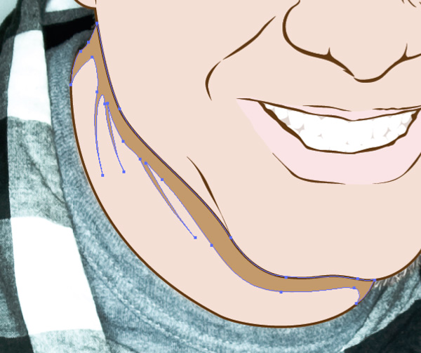
If you want a floating head you can stop there, but if you want a place for the head to rest simply trace the neck shape and apply the same colors and stroke as the face.
STEP 11B
Add a simple shade shape to the neck and choose a shade of brown that is close to the skin color (#C49A6B), so that it doesn't stick out like a sore thumb. Send this shape to the back (Select > right click > Arrange > Send to Back).
STEP 12
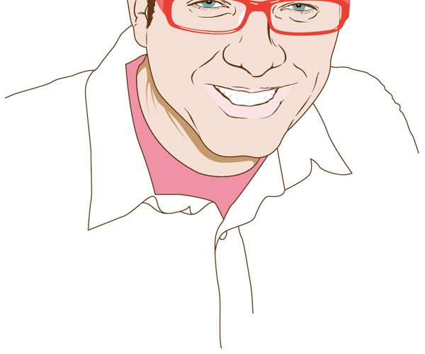
Add a few shapes and lines to describe the shoulders and shirts.
Add a few shapes and lines to describe the shoulders and shirts.
STEP 13
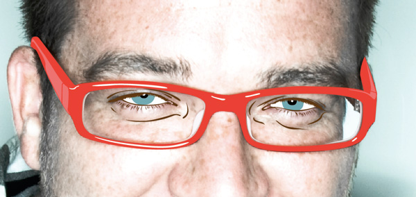
After looking at the image, I notice that the coke bottle glasses effect is going on with the eyes. Select all the shapes that form the eyes, and enlarge them just a bit.
STEP 14
Just for composition, add a light blue (#C2E6EA) background to the illustration.

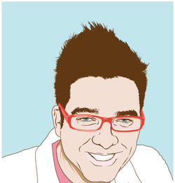
FINAL IMAGE
Thats it! Very basic, but learn to do it well and it can be a very useful illustration style. The final image is below. You can view the larger version here.
DON'T EVEN THINK OF SENDING THIS TO ME AS YOUR FINAL PIECE . . . CAN YOU SPELL "F"?
I hope you had at least a little bit of fun doing this Exercise. See you soon.
Ms. Babkie
