
Emphasis is the part of the design that catches the viewer's attention.
Usually the artist will make one area stand out by contrasting it with other areas.
The area could be different in size, color, texture, shape, etc.
Movement is the path the viewer's eye takes through the work of art, often to focal areas.
A color shift is one of the most common ways to create emphasis in a design.
The more contrast used in the shift of shades, the more the point demands the viewer's attention.
Soft contrasts might gradually draw attention from one page area to another,
while a bright contrast makes a clear statement.
ASSIGNMENT Part 1:
Please watch the following 2 Videos for some information about EMPHASIS in GRAPHIC DESIGN
ASSIGNMENT Part 2:
Write a brief 10 - 12 sentence paragraph describing
YOUR UNDERSTANDING OF EMPHASIS as it relates to GRAPHIC DESIGN
Write it in WORD and name the File: (Your) Name_EmphasisParagraph_PdX
Please include any images you think would help you understand Emphasis better.
If you quote an article directly, please use "Quotation" marks and include the website at the
bottom of your Word page. If you are quoting a few websites, please number each one:
For Example:
"Emphasis in graphic design is one of the many tools or “principles” of design used by professionals.
The purpose of emphasis is to identify the “star of the show” in a composition.
With emphasis in design, you highlight a specific element, or group of elements as being more important than the rest." (1)
(1) https://fabrikbrands.com/emphasis-in-graphic-design-emphasis-principle-of-design/
Please ask me questions any time
Turn in your Paragraph in CANVAS in the Principle of Design: EMPHASIS Assignment
Well Done!!!
Other Videos about EMPHASIS:
https://www.youtube.com/watch?v=K7NTqwkUNa4
https://www.youtube.com/watch?v=KjAARYTTxHk
https://www.youtube.com/watch?v=K7NTqwkUNa4
https://www.youtube.com/watch?v=KjAARYTTxHk

Rhythm - in design - can also be called Repetition, Movement, Energy. Rhythm allows your designs to develop an internal consistency that makes it easier for your customers to understand. Once the brain recognizes the pattern in the rhythm it can relax and understand the whole design. Repetition rarely occurs on its own and so it imbues a sense of order onto the design. And because of this, Rhythm attracts attention and prompts customers to investigate further.*
Rhythm refers to the way your eye moves throughout a picture. Some pictures move you throughout in a connected, flowing way much like a slow, stately rhythm in music. Other pictures move you from one place to another in an abrupt, dynamic way much like a fast, staccato rhythm in music will give you the impression of movement. Rhythm in art is created by the repetition of elements. Similarity of elements, or flowing, circular elements will give a more connected flowing rhythm to a picture, while jagged, or unrelated elements will create a more unsettling, dynamic picture. **
* http://webdesign.about.com/od/webdesignbasics/p/aarhythm.htm
** https://sites.google.com/site/principlesofdesignsite/home/rhythm-movement
PRINCIPLES OF DESIGN: RHYTHM: Part 1
Please FIND an article about Rhythm in Graphic Design.
Cite the article - where is it? If it's on the Internet, you MUST put the website.
Please write a paragraph, of 10 - 12 sentences, telling about Rhythm in Graphic Design.
Your paragraph should talk about what you understand about Rhythm in Graphic design.
Write the Paragraph in Word - Don't forget how to name / save your file:
(Your First) Name_RhythmParagraph_PdX.docx
Submit in the CANVAS Assignment
------------
Open the Word file below to see how the Paragraph about
Rhythm in Graphic Design should be set up
| babkie_rhythmparagraph_pd5.docx |
RHYTHM - PART 2: BELIEVE 2022 Poster
(Babkie will provide the BELIEVE 2022 LOGO)
Treasure Coast Dance (Logo) Presents
BELIEVE 2022 (LOGO)
Friday - May 13th @ 7:00 pm
Saturday, May 14th @ 2:00 & 7:00 pm
Sunday, May 15th @ 2:00 & 7:00 pm
Doors Open 30 minutes before the Show
TCHS Auditorium:
1000 SW Darwin Blvd - Port St. Lucie
Tickets: $15.00 available through ticketspicket.com
For More Information Contact: [email protected]
See below for the Poster Specs . . .
The Poster Specifications are as follows:
3 Art Boards
11" x 17" (Tabloid)
Portrait
1/2" Margin all around (Safety / Live Art Area)
Make a Rectangle 10 x 16, center it on the artboard
Right Click > Make Guides > RC - Lock Guides
You MUST use the POD: Rhythm as the basis for your Design
Use the POD: Balance to guide your Layouts:
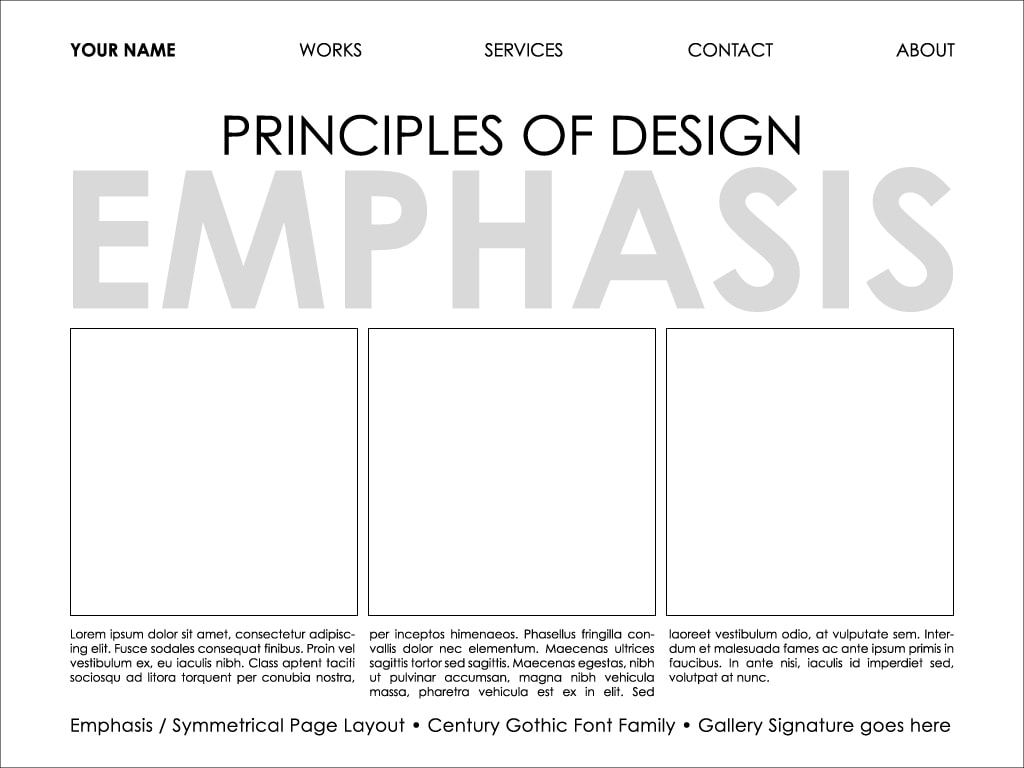
1 Poster = Symmetrical = Font: Century Gothic: Regular & Bold
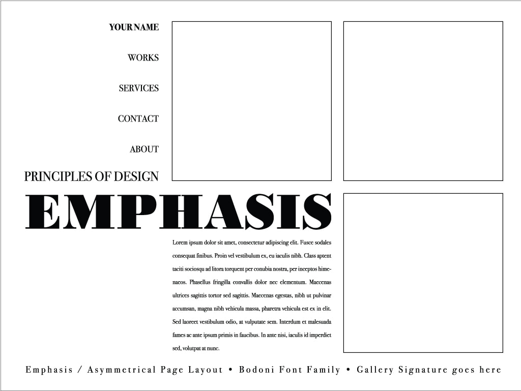
1 Poster = Asymmetrical = Font: Gill Sans: Regular & Bold
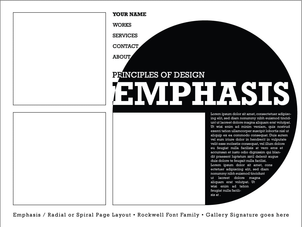
1 Poster = Radial = Font: Eras: Regular & Bold
PART 1 • EMPHASIS PROJECT • WEEK OF 1/4 - 1/8
Please NOTE! If you have done this Part already, please move on to the next Part
Please write 10 - 12 sentences describing your understanding of the Principle of Design: Emphasis
CHECKLIST / RUBRIC
1) Your Emphasis Paragraph should be written as a Word File
2) 10 - 12 Sentences
3) Double-Spaced.
4) Your Emphasis Paragraph must be written in your own words
AND / OR
5) If you do quote any part of the article you must put "quotation" marks around the quote.
6) Put your Name, the Date and what Period you are in at the top of the page.
7) NAME YOUR FILE CORRECTLY:
(Your First) NameEmphasisParagraphPdX.docx
8) Please e mail your Emphasis Paragraph Word File FROM YOUR SCHOOL E MAIL to me at:
[email protected]
Please also look at the Visual Samples of Emphasis shown below.
This part of the POD/Emphasis Project must be done BEFORE you may go on to Part 2 . . .
Part 2: Emphasis / Balance Worksheet 1/6 - 1/7 2020
Download the worksheet below
Rename the Worksheet:
(Your) NameEmphasis_Balance_Worksheet_PdX . . .
Download the worksheet below
Rename the Worksheet:
(Your) NameEmphasis_Balance_Worksheet_PdX . . .
| emphasis_balance_worksheet.docx |
Click on the first picture in the Gallery below to see the full image. To go to the next image, click the next arrow ( > ).


BALANCE PROJECT PART 1 • October 28 - 31
Please write an Introductory Paragraph describing the 3 Forms of the Principle of Design: Balance.
This site has an excellent PDF with an intro paragraph:
www.getty.edu/education/teachers/building_lessons/principles_design.pdf
NEXT
Write another brief paragraph describing each form of Balance:
Symmetrical, Asymmetrical and Radial.
This website has some good descriptions of Symmetrical and Asymmetrical:
https://www.pluralsight.com/blog/film-games/understanding-balance-graphic-design
The following site has a good description of Radial Balance:
https://www.smashingmagazine.com/2015/06/design-principles-compositional-balance-symmetry-asymmetry/
Please type this all up in Word, include your name, GD II and the Period.
BALANCE PROJECT PART 2
OCTOBER 28th - NOVEMBER 4th
Page Set-Up Specifications:
Make a New Document in Illustrator:
Print > Letter (8.5 x 11) > Portrait > Art Boards: 3! . . .
Design Assignment:
Start looking at Type and Typography . . .
Design 3 pieces - each form of Balance - in one 7.5 x 7.5" Square for each form.
Each Square should have a 4' Black Stroke, Aligned to the Inside.
Position the Square in the center of the art board using the Alignment Tools
And bring the top of the Square a 1/2 (.5) inch from the top of the page.
Example: One Square for Symmetrical, One Square for Asymmetrical and one for Radial.
You will use ONE letter to do each design.
DO NOT USE THE FIRST FONT THAT SHOWS UP ON YOUR PAGE!!!!!!
Use one of our System Fonts
Look for an interesting typeface for this project.
And when you choose a font, see if the letters are more fun in lower case or capitals.
All 3 Parts of the Project should be done with Letters or Numbers.
Hint:
You will use any Transformations, and you will use the Pathfinder Tools
BALANCE PROJECT PART 3
NOVEMBER 7 - 11
3 Balance Posters Specifications:
• You will design 3 Posters. each Poster will follow the Principle of Design: Balance.
• Do one Poster using Symmetrical Balance
• Do one Poster using Asymmetrical Balance
• Do one Poster using Radial Balance
Using Illustrator, Design 3 Posters using the Principle of Design: Balance.
Page / Art board Size : 11 x 17 (Tabloid)
Make a Border: 10 x 16 (.5" Margins all around)
The Border Specs = Black 8 Point Stroke - No Fill
Then, set Guides .5" INSIDE the Border
Use the Rectangle tool to set that up | Then Right Click > Make Guides
LOCK GUIDES: Right Click > Lock Guides
Use the Essay Paragraphs as your Topic.
Use your 3 Balance Designs as your Imagery.
HEADLINE: Principles of Design: Balance
3 FONTS:
Symmetrical Poster | Century Gothic: Bold for the Headline | Regular for the Body Copy
Asymmetrical Poster | Eras Bold and / or Demi Bold for the Headline | Regular for the Body Copy
Radial Poster | Gill Sans: Bold for the Headline | Regular for the Body Copy
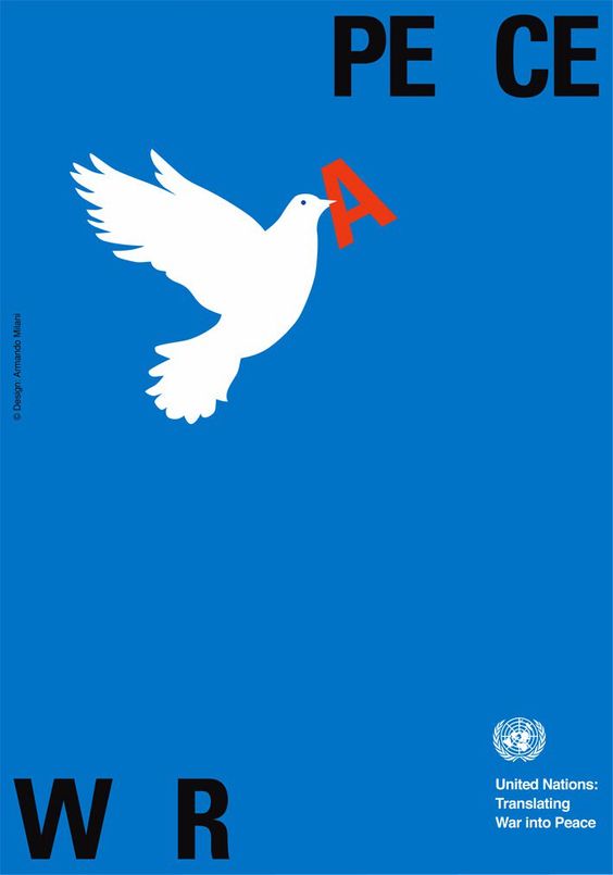
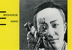
When we look at a drawing or painting, there’s always something that intrigues us
more than anything else in that piece.
This is a method used by artists who want to divert our attention towards the most important.
The technical term for this technique is called ‘emphasis.’
Emphasis mainly serves as the focal point or main highlight of any artwork.
In graphic design, emphasis can be achieved by using colors, visual weight, size and page placement
that are naturally attractive to the human eye.
This is done by using various principles such as contrast, movement or repetition.
When it comes to text, the main words to focus on can be highlighted using bold or italic type, maybe ALL CAPS.
EMPHASIS PROJECT: PART 2.2: 3 Emphasis / Balance Designs
Create 3 Art boards: Size: Letter • Portrait • .5" spacing between boards • 3 in a row to right -->
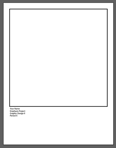
On the first page Create a Square using the Rectangle Tool (M)
Click it on the page: 7.5" x 7.5" • 3' Stroke / Aligned to the Outside • Align Centered on the Art Board
Align the top of the Square .5" from the Top of the Page
Type your Gallery Signature:
Click the Type Tool under the left side of the Square - NOT TOUCHING the BOARDER
Type:
Your First & Last Name (Hit Enter) Emphasis Project (Hit Enter) Graphic Design II(Hit Enter) Period X
The Gallery Signature should look like this:
Your Name
Emphasis Project
Graphic Design II
Period X
Winter 2020
Align the Gallery Signature with the Left Side of the Boarder Square - it should not touch the boarder
The Page should look like this:
PART 2.2: Create 3 Designs using Emphasis AND 3 forms of Balance . . .
Using your favorite 1st year project choice, create 3 designs using Emphasis:
For example: Say your favorite project was the CD Design Project. Create 3 different designs for a CD Cover.
You will do 3 different designs using Emphasis in each one - it must be a different Emphasis approach
For example: Each of the 3 different designs should show a very clear example of Emphasis,
maybe the majority of the design is Grayscale or any monotone color
you might put an area of a bright contrasting color.
Look at the examples in the gallery just below here to get some inspiration.
Don't get too fancy guys! You have only 1 week to do all 3 designs!
AND you must also use the 3 forms of Balance in the Layout of that design.
Symmetrical, Asymmetrical and Radial Balance.
PART 3: Emphasis / Balance
Design a (3)Webpage(s) to display your 3 Emphasis / Balance Designs
| websitetemplates.ai |
So now we will create
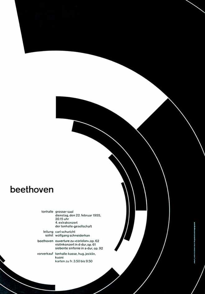
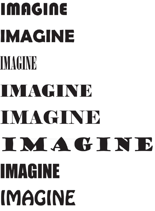
| babkie_rhythmimagineposterpd3.docx |
PART 3: CREATE AN EMPHASIS WEBSITE
BACKGROUND COLOR
3 DESIGNS
TITLE OF THE WEB SITE: EMPHASIS
Include your Descriptions from each Design (see sbelow)
WELCOME PAGE
CONTACT
ABOUT ME (YOUR INFO)
Create a web site, include all of the above.
Include your Emphasis Paragraph.
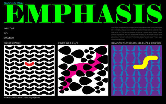
EMPHASIS should be the defining Principle of Design that guides the Layout.
3 DESIGNS
TITLE OF THE WEB SITE: EMPHASIS
Include your Descriptions from each Design (see sbelow)
WELCOME PAGE
CONTACT
ABOUT ME (YOUR INFO)
Create a web site, include all of the above.
Include your Emphasis Paragraph.
EMPHASIS should be the defining Principle of Design that guides the Layout.

WEEK OF
PART 2 • Creating your own EMPHASIS Designs
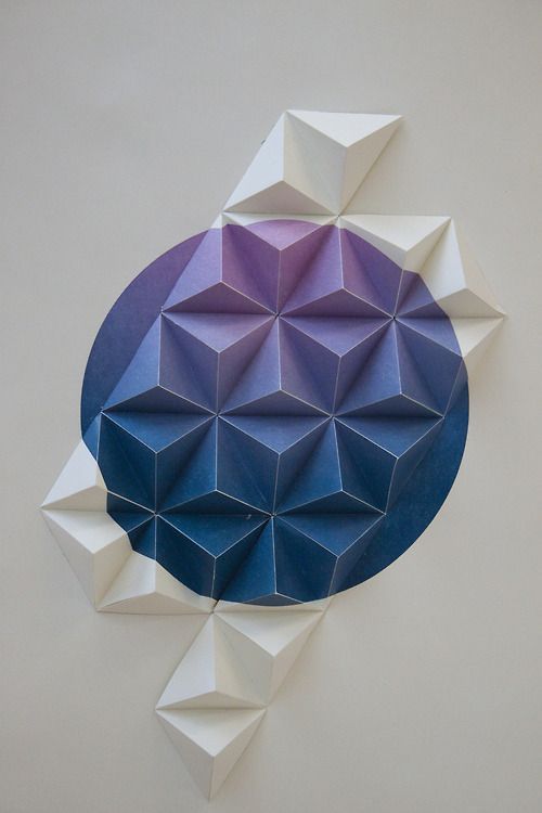
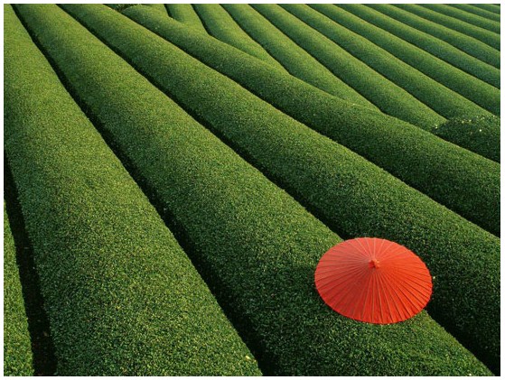
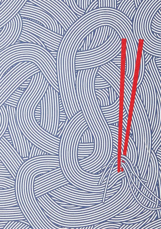
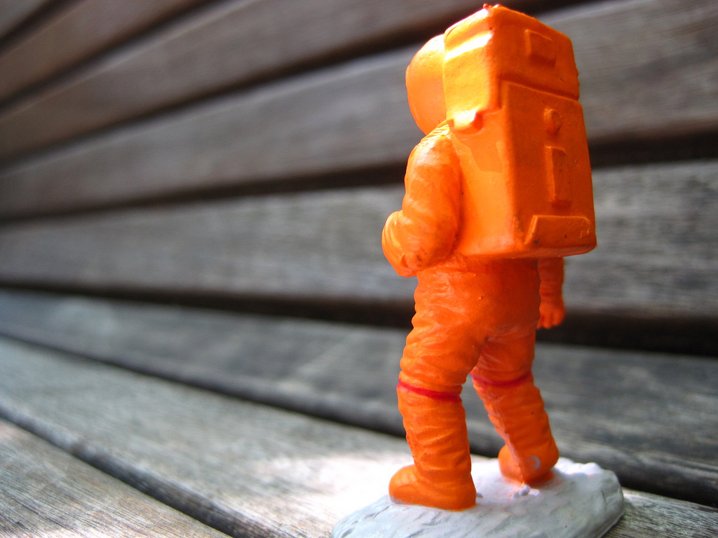
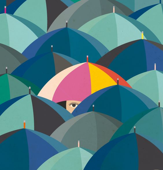
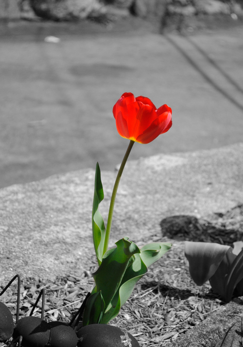
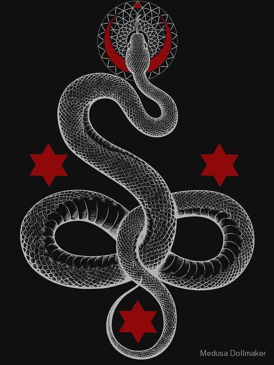
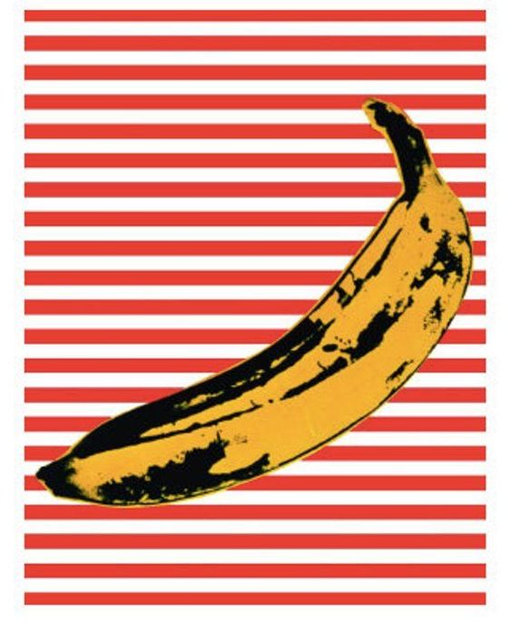
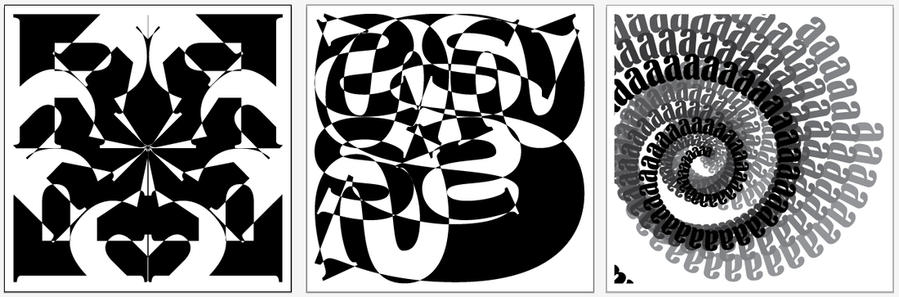
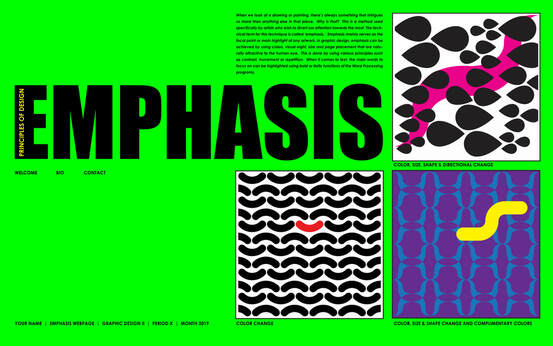
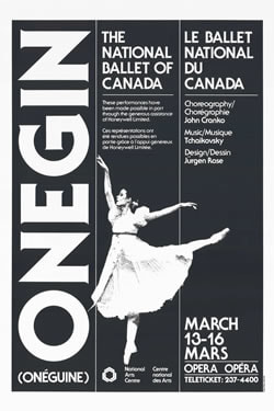
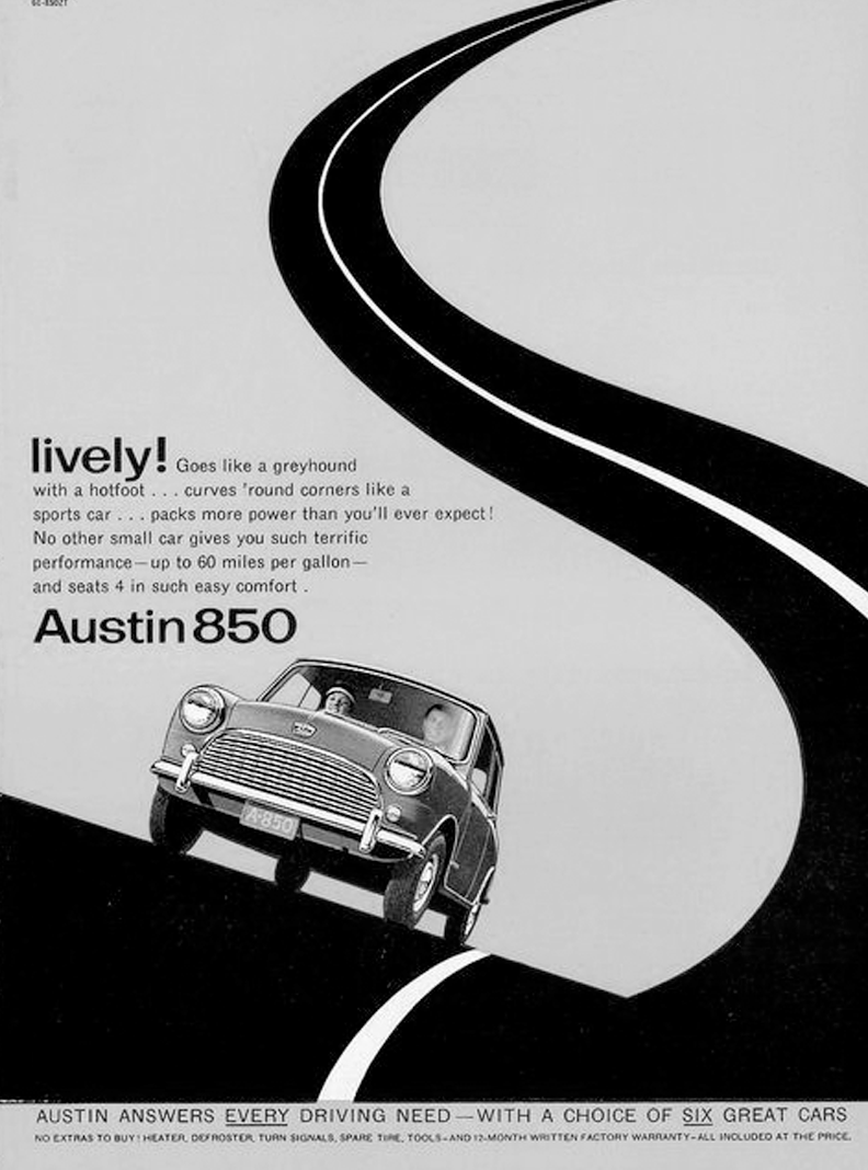
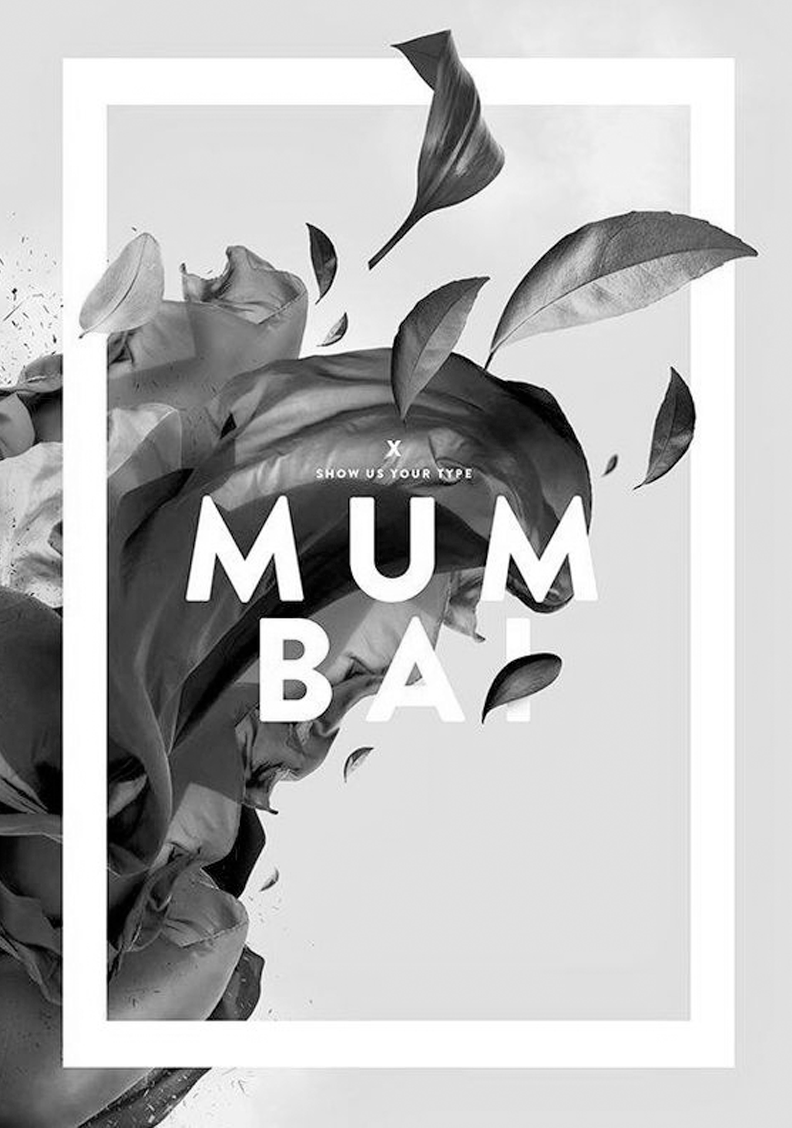
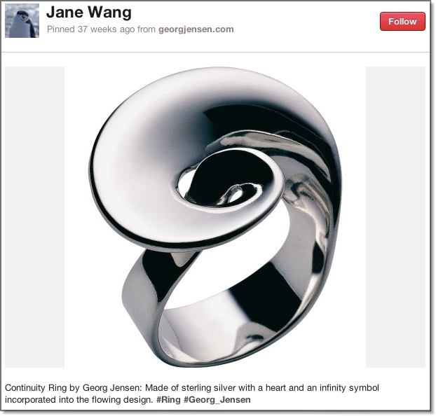
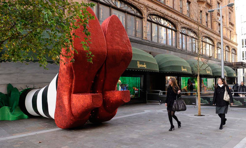
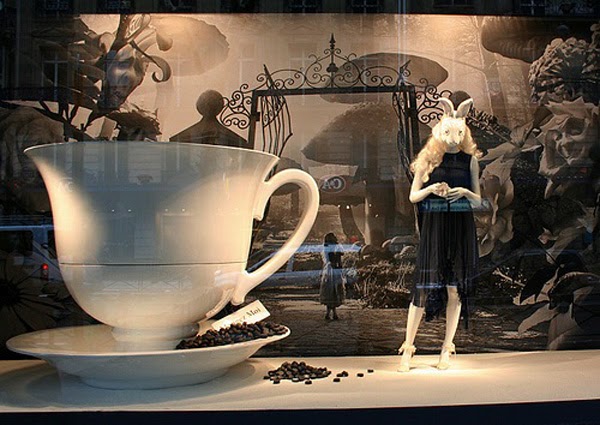
Here are a number of examples of Emphasis (below Part 1).
We can find Emphasis in Nature, Design, Advertising and other forms.
Please take a moment to look at these samples of Emphasis.
What do you notice that makes these examples of Emphasis?
Create 3 Designs using the P.O.D Emphasis
You may use Images and your own Previous Designs
For Images - work in Photoshop
For Vector Art - Work in Illustrator
3 EMPHASIS DESIGNS • PART 2 RUBRIC
In Illustrator
1) Set up 3 Art Boards in one Work Space
8.5 x 11" (Letter)
2) Border: 7.5 x 7.5 inches
Position the Border 1/2 Inch margin from the Top and Sides
Border Stroke weight: 3 Points
3) Live Art Area / Safety area is: 7 x 7 "
You must properly Save and Name your Files:
(Your First) NameEmphasis3DesignsPdX.xxx
You must put a Gallery Signature on each of the pages:
Your Name
Principles of Design: Emphasis
Graphic Design II
Period X
PART 2 • Creating your own EMPHASIS Designs
Here are a number of examples of Emphasis (below Part 1).
We can find Emphasis in Nature, Design, Advertising and other forms.
Please take a moment to look at these samples of Emphasis.
What do you notice that makes these examples of Emphasis?
Create 3 Designs using the P.O.D Emphasis
You may use Images and your own Previous Designs
For Images - work in Photoshop
For Vector Art - Work in Illustrator
3 EMPHASIS DESIGNS • PART 2 RUBRIC
In Illustrator
1) Set up 3 Art Boards in one Work Space
8.5 x 11" (Letter)
2) Border: 7.5 x 7.5 inches
Position the Border 1/2 Inch margin from the Top and Sides
Border Stroke weight: 3 Points
3) Live Art Area / Safety area is: 7 x 7 "
You must properly Save and Name your Files:
(Your First) NameEmphasis3DesignsPdX.xxx
You must put a Gallery Signature on each of the pages:
Your Name
Principles of Design: Emphasis
Graphic Design II
Period X


| gdii_rhythmposterrubric.docx |

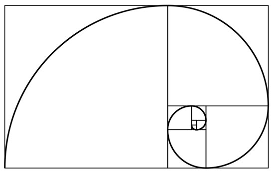
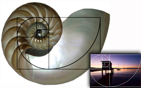
Figure 1.
MONDAY • 2/8 - 2/12 • 2016
PART 2: Create 3 Pages of Advertising Design using Proportion & Scale
PLEASE READ THE INFORMATION AT THIS LINK BEFORE PROCEEDING FURTHER . . .
Using Proportion & Scale and the information you read at the above link
create 3 Pages of Advertising Design using the following specifications:
3 Pages: Black & White • 8.5 x 11" • 2 Portrait Format • 1 Landscape Format
The Subject Matter is your choice of the Following:
A Gallery Opening • A Concert by a Musician
A 2- or 3-D Artist or a Musician of Spoken Word, Rap, Instrumentalist.
Some Visual Artists to Consider are . . .
Georgia O'Keefe: Painter • Banksy: Modern Day Graffiti Artist
Please consider World Famous Photographers, Graffiti Artists and Graphic Artists
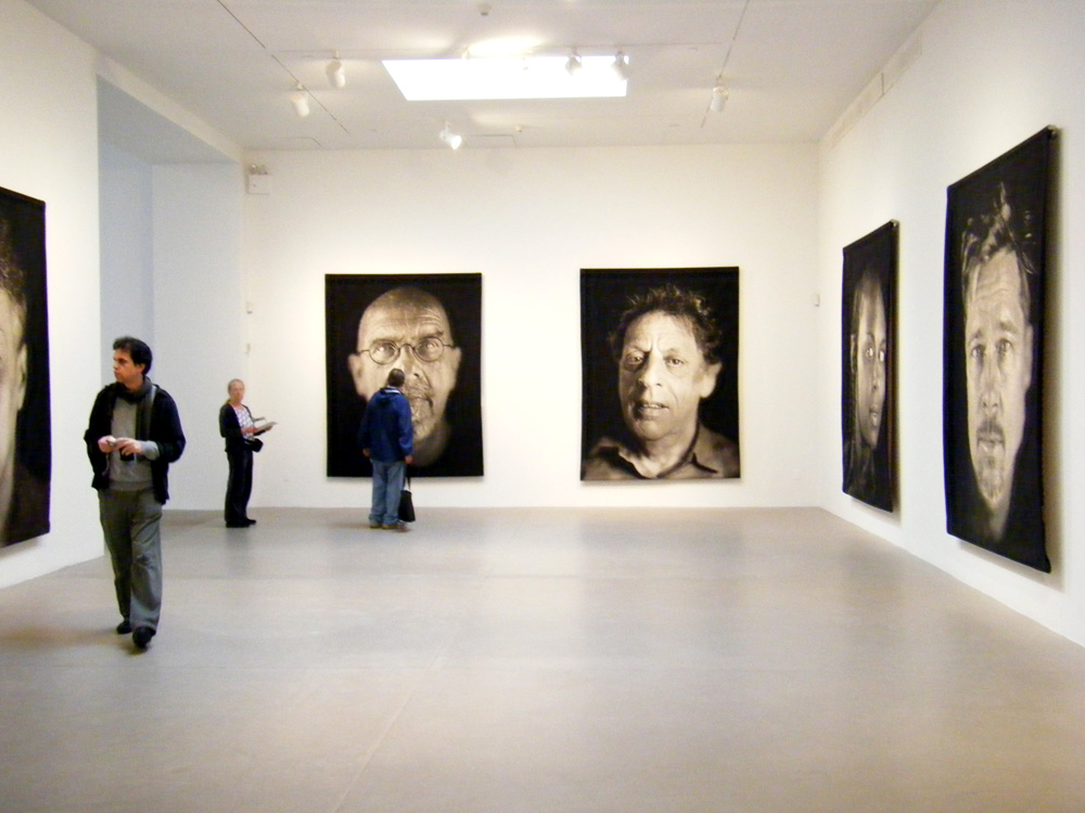
Also check out Chuck Close - Painter
See below these Images for the RUBRIC . . .
PART 2: Create 3 Pages of Advertising Design using Proportion & Scale
PLEASE READ THE INFORMATION AT THIS LINK BEFORE PROCEEDING FURTHER . . .
Using Proportion & Scale and the information you read at the above link
create 3 Pages of Advertising Design using the following specifications:
3 Pages: Black & White • 8.5 x 11" • 2 Portrait Format • 1 Landscape Format
The Subject Matter is your choice of the Following:
A Gallery Opening • A Concert by a Musician
A 2- or 3-D Artist or a Musician of Spoken Word, Rap, Instrumentalist.
Some Visual Artists to Consider are . . .
Georgia O'Keefe: Painter • Banksy: Modern Day Graffiti Artist
Please consider World Famous Photographers, Graffiti Artists and Graphic Artists
Also check out Chuck Close - Painter
See below these Images for the RUBRIC . . .

MONDAY • 2/1 - 2/5, 2016
PART 1 : RESEARCH & WRITE ABOUT PROPORTION & SCALE
Go to the Internet / World Wide Web and research Proportion & Scale.
Write a Paragraph (10 - 12 sentences) or more on what you understand to be Proportion & Scale.
Write specifically about the above Image (Figure 1).
What is the significance of that iconic image?
BONUS POINTS!!!!!
Which contemporary band, wrote a song or based the measures and lyrics
of a song or songs on the above Sequence?
Write specifically about the Rule of Thirds.
RUBRIC for the above assignment:
Essay is to be written as a Word Document
Double Spaced between the Lines
10 - 12 Sentences IN YOUR OWN WORDS:
Speak / Write as if you were telling the details of P & S
to your friend, a parent, a student - just speak and write naturally.
Save / Name the File as you normally do:
First (Name)P+S_EssayPdX.docx
Please put your Name, the Date, the Assignment and the Period on the Essay somewhere
E-Mail me the File from your School Webmail:
Username: Your 562 . . . @stlucieschools.org
Password: Your 5-Digit Lunch Number
| emphasis_rubric.docx |
| fontology_typeemphasis.pdf |
TEN PRINCIPLES OF GOOD DESIGN . . . ACCORDING TO DIETER RAMS
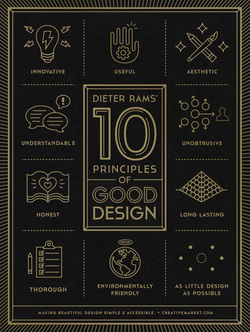
I found this fabulous Article / Blog in an e mail that came to me.
I thought about you guys when I saw it.
I figured, since working through the Principles of Design,
it would be so appropriate to include this.
Click on the image to the left to go to the article / Blog.
AND - the poster is downloadable too!
