 |
These exercises may take you the whole class or even 1 and a half. It's mostly about special effects and working with text and the appearance window. This is a slightly more advanced exercise. And some of the effects may not work on our computers for reasons we may not know. It's not you, it's technical difficulties beyond our control sometimes. When that happens, take a break and do something else. Come back to this and try it again. It's just the way things go sometimes. |
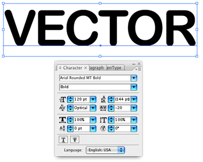 |
STEP 1 Simply type your text on the page. I’ve used "Arial Rounded MT Bold" in 120pt size with centered text align. You can use any font you like, however I would recommend using a bold font. Depending on the font, regular or medium weights may work well too. Gradients and "outlines" on lighter or more condensed fonts can easily look distorted. |
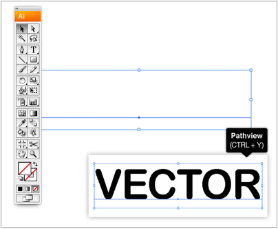 |
STEP 2 In the tools panel, delete all fills and strokes from your text. If you turn on View > Outline View (Command + Y) you can still see what you wrote. |
 |
STEP 3 Open the Appearance Panel and add a new fill. |
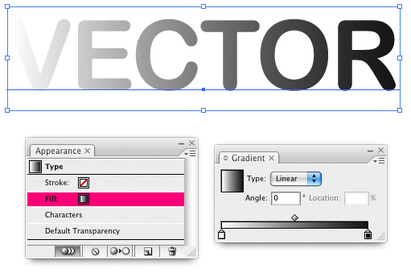 |
STEP 4 You can now apply a gradient to the fill of the letter. Either select a gradient from the swatch panel or select "Linear" in the Gradient Panel to add the gradient fill. |
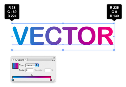 |
STEP 5 Change the colors to a bright Blue and Pink, almost Cyan and Magenta. The Purple will be made from these two colors blending. |
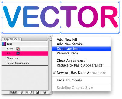 |
STEP 6 Now we want the gradient to be an outline. To achieve this we will first have to duplicate our fill in the Appearance Panel. |
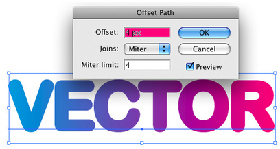 |
Step 7 Select the lower fill from the Appearance Panel and go to Effect > Path > Offset Path and create an offset of 4px (pixels). |
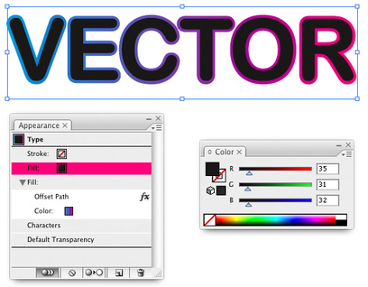 |
STEP 8 In the Appearance Panel you can now add a solid color to the top fill. In the example I used an almost black fill (R: 35 / G: 31 / B: 32). |
 |
STEP 9 For the final result we will simply add a solid (R: 255 / G: 179 / B: 232) color as background. A very easy way to apply a gradient outline to text. |
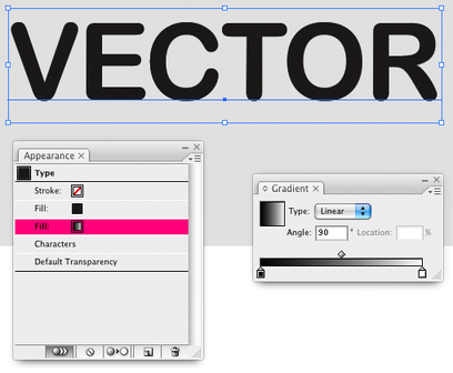 |
STEP 10 Using what you just learned you can create a lot more effects. For example you could create a shadow for the text. For this effect we will start out with one solid fill and a simple black to white gradient applied to the lowest fill. Set the gradient fill to multiply. |
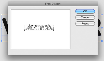 |
STEP 11 For the perspective we will use an effect: Go to Effect > Distort & Transform > Free Distort. Move the upper corners in an appropriate position for you. In this case the light source would be centered in front of the letters. |
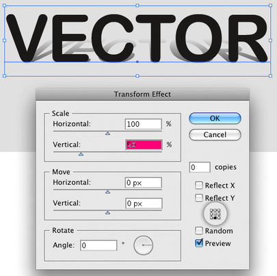 |
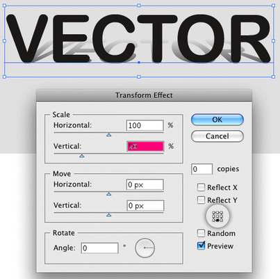
STEP 12 The shadows should be not as high as the "standing" letters. So we will apply another effect: Go to Effect > Distort & Transform > Transform and change the vertical height of the fill to 50%. Note: It is important to set the Reference Point of the effect to the bottom! |
 |
STEP 13 If you want the "shadow" to be shorter, you can change the position of white in the gradient to a location below 100%. |
 |
Cooooooool! Here’s the result. Within only a few steps you created a text with a gradient shadow. |
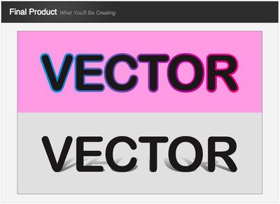 |
Conclusion This was just two ways that the Appearance Panel can create great looking effects for editable text. Play around with some of the other settings in the panel and see what you can come up with! I hope you’ve enjoyed these exercises. |
This website is created and maintained by Amy Babkie, who is soley responsible for its content. The School Board of St Lucie County, Florida, Treasure Coast High School, and representatives for the School Board and the School (i) have not reviewed or approved the content of this site, and (ii) do not sponsor or endorse the content of any view expressed on this site.
